How do the iconic Joker colors of toxic purple, chemical green, and manic orange continue to serve as a visual manifesto of psychological chaos across comic books, cinema, and digital media?
In the world of visual storytelling and graphic arts, these specific hues are deeply rooted in color psychology, purposefully selected to subvert traditional heroic tropes and communicate immediate moral corruption.
For comic book historians, character designers, and modern content engines, analyzing this enduring color scheme provides profound insight into how visual identity builds narrative authority.
From his 1940 debut panels to contemporary cinematic masterworks, the character’s vibrant signature shades permanently redefined how global pop culture visually registers villainy.
Read on to discover fresh psychological breakdowns, costume design secrets, and essential lore surrounding the legendary impact of the official joker colors.
Deconstructing the Psychological Impact and Meaning of Toxic Purple
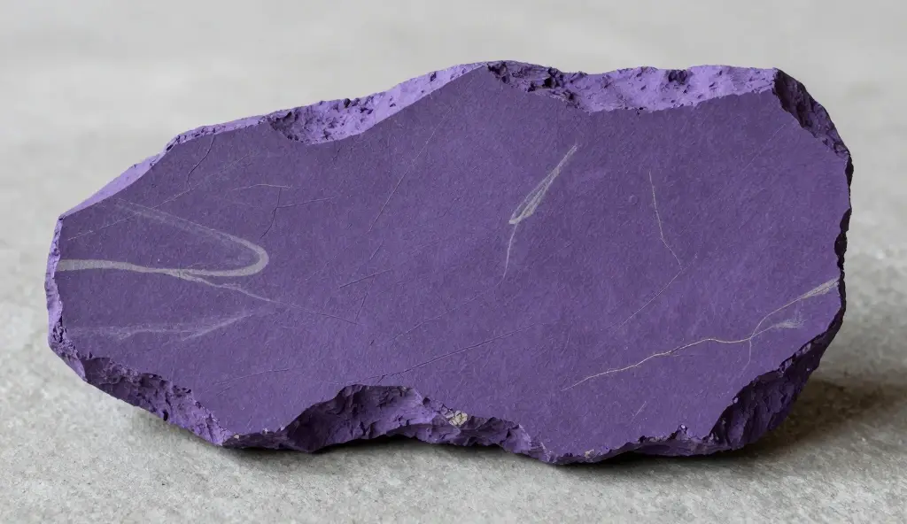
- 💜 Historically associated with royalty, the deep violet hue is twisted into a symbol of absolute, unhinged criminal majesty. 👑
- 💜 Visual artists use purple because it sits directly opposite heroic primary colors like Superman’s bright red or blue. 🚫
- 💜 The rich jewel tone creates an immediate, striking contrast against the dark, rainy concrete architecture of Gotham City. 🏙️
- 💜 Color theorists associate deep violet with vanity, extreme eccentricity, and a highly theatrical approach to crime. 🎭
- 💜 Wearing tailored fine fabric coats suggests an underlying desire for corporate high-society status and absolute respect. 🕴️
- 💜 The shade perfectly highlights the character’s complex dual identity as both a terrifying monster and a funny showman. 🤡
- 💜 Across classic comic publication history, the violet hue shifts from deep midnight tones to bright neon lavender shades. 🎨
- 💜 The hue symbolizes the character’s complete detachment from normal societal norms and standard civilian styling choices. 🌀
- 💜 Matching his formal tailored suits with chaotic actions enhances the overall unsettling, post-modern nature of his crime. ⚖️
- 💜 Sourcing the exact pigment for the costume material requires an extra sharp eye for visual saturation levels. 👁️
- 💜 The deep color masterfully masks organic blood stains, keeping the villain’s tailored appearance perfectly pristine during street brawls. 🩸
- 💜 The psychological weight of the color conveys a massive sense of dark, unyielding, and completely un-brie-lievable ego. 🧠
- 💜 Modern digital colorists use deep plum gradients to cast realistic, highly atmospheric shadows across his face panels. 🖌️
- 💜 Ultimately, the purple suit stands alone as a supreme, timeless cinematic monument to sophisticated villainous fashion history. 💎
Unraveling the Symbolic Chaos of Chemical Green Hair and Accents
- 💚 The unnatural chartreuse hair tint serves as a permanent, living brand mark of his historic toxic chemical accident. 🧪
- 💚 In classic animation layouts, vibrant lime green is universally utilized to visually represent poison, radioactivity, and absolute corruption. ☢️
- 💚 The shocking neon hair instantly commands absolute focus, ensuring he remains the undeniable focal point of any frame. 🚨
- 💚 Green symbolizes a sick, perverted sense of personal rebirth, transforming a failed comedian into a chaotic mastermind. 🔄
- 💚 The acid-toned hair color beautifully mirrors the chaotic, unpredictable mental state lurking directly beneath the scalp. 🧠
- 💚 Comic illustrators combine the green strands with pale bleached skin to establish a highly disturbing, corpse-like physical aesthetic. 💀
- 💚 The vibrant color palette subverts natural organic tones, emphasizing his completely artificial, human-made origin story details. ⚙️
- 💚 The visual interplay between green hair and a purple coat creates an instantly recognizable, globally famous complementary contrast. 🎨
- 💚 Costume designers track how different lighting setups transform the hair from a dirty forest tone to radioactive emerald. 💡
- 💚 The color acts as a literal visual warning label to any local Gotham citizen or passing law enforcement officer. 🚓
- 💚 The specific hue choice emphasizes his total rejection of traditional, boring human grooming and societal standards. ✂️
- 💚 Toy manufacturers work intensely to replicate the exact, highly specific chemical hair tint across premium collectible action figures. 🧸
- 💚 The striking green coloration represents the ultimate, literal manifestation of absolute internal madness breaking out into reality. 🌋
- 💚 Celebrating this distinct visual choice keeps the historic character concept incredibly vibrant, active, and alive online today. 🎉
The Energizing Terror of Manic Orange Vests and Linings

- 🧡 The inclusion of a bright pumpkin vest adds a brilliant, festive explosion of manic energy to his formal attire. 🎃
- 🧡 Color psychology states that orange sparks high alertness, frantic movement, and an intense lack of internal impulse control. 🎛️
- 🧡 The fiery tone breaks up the purple suit, introducing a highly chaotic element that perfectly mirrors a burning bonfire. 🔥
- 🧡 The shade connects beautifully back to classic circus clown aesthetics, twisting childhood fun into psychological horror elements. 🎪
- 🧡 Screenwriters love how the warm orange fabric catches internal studio lighting, casting a sickening glow on his face makeup. 🎞️
- 🧡 The bright vest functions as a literal target, showcasing his absolute, fearless disregard for personal physical safety. 🎯
- 🧡 The bold color contrast ensures the character stands completely apart from the muted, gray color schemes of low-level thugs. 🏢
- 🧡 The tone shifts seamlessly across different media iterations, moving from a subtle mustard hue to blinding neon crimson. 📊
- 🧡 The warm fabric layer adds an incredibly unique, multi-tiered visual texture to high-end cosplay costume builds. 🧵
- 🧡 The color serves to completely strip away any lingering sense of traditional realism, leaning heavily into comic theatricality. 📚
- 🧡 The vibrant orange detailing highlights his deep, genuine love for chaotic showmanship and grand public attention. 📣
- 🧡 Virtual photographers love capturing the stark orange contrast against the dark, rainy streets of digital game worlds. 🎮
- 🧡 The specific fabric color choice beautifully completes the iconic, historical trinity of his core character visual identity. 🏛️
🧡 Adding this bright element to his ensemble ensures his silhouette remains completely unparalleled within the superhero movie genre. 🌟
Face Paint Typography: The Unforgiving White, Red, and Black Canvas
- 🤍 The chalk-white skin background acts as a stark, cold void that permanently erases his past human identity. 🌫️
- 🤍 The smeared red smile stretches far past the natural lip line, creating a horrifying, permanent caricature of human joy. 💋
- 🤍 The crimson mouth makeup evokes immediate visceral associations with raw wounds, fresh bloodshed, and savage visceral cruelty. 🩸
- 🤍 Thick black or dark blue charcoal circles hollow out the eyes, mimicking a terrifying, empty skull-like facial structure. 💀
- 🤍 The dramatic makeup styling draws absolute focus to his expressive facial distortions, maniacal laughter, and chilling intense stares. 🗣️
- 🤍 The imperfect, cracked texture of the face paint symbolizes a rapidly deteriorating, fractured internal psychological foundation. 🪞
- 🤍 Graphic artists utilize harsh facial shadows to make the painted expression shift dynamically from comedic to profoundly terrifying. 🎭
- 🤍 The messy, asymmetrical application highlights his complete lack of concern for clean corporate presentation or traditional aesthetics. ❌
- 🤍 Cosplay creators spend hours blending the white base to achieve an authentic, weathered, and highly realistic cinematic appearance. 🎨
- 🤍 The face paint functions as an absolute psychological shield, completely blocking the world from seeing the real human underneath. 🛡️
- 🤍 The iconic color mapping remains an immortal, globally recognized visual shorthand for absolute, unbridled madness in art history. 🏛️
- 🤍 Modern digital filters allow fans to instantly superimpose the classic color layout onto their own social media videos. 📱
🤍 The raw visual terror generated by the painted mask remains completely unmatched across the entire history of modern fiction. 💎
The Golden Age Evolution: Vintage Color Layouts of the 1940s to 1960s
- 📜 Early comic book printing limitations in 1940 demanded highly saturated, simple flat ink applications for maximum paper legibility. 🖨️
- 📜 The original printing process utilized high-contrast colors to ensure his features popped on cheap, pulp-quality paper stock. 📰
- 📜 The classic mid-century animated appearances locked in the standard royal purple coat and bright yellow silk shirt combination. 👔
- 📜 The bright color scheme matched the lighthearted, campy tone of silver age television broadcasting regulations perfectly. 📺
- 📜 Vintage comic panels avoided gritty shadows, opting instead for clean lines and incredibly bright, popping color fields. 🎨
- 📜 The simplified visual look laid the crucial groundwork for all subsequent dark, modern cinematic reinterpretations of the character. 🏛️
- 📜 Collectors highly value pristine, vintage comic issues that showcase the original, un-restored historical ink pigment configurations. 📈
- 📜 The classic look remains a massive favorite design template for nostalgic throwback merchandise and clothing lines today. 👕
- 📜 The retro color mapping beautifully demonstrates how editorial standards heavily shape the long-term visual history of a brand. 📝
- 📜 Classic comic cover artists utilized flat yellow backgrounds to make the purple and green figure pop immediately on newsstands. 🏪
- 📜 Understanding the historical limits of mid-century printing technology is completely emmental for any serious comic book scholar. 📖
- 📜 The historic era proved that his core visual identity was strong enough to survive diverse stylistic shifts over decades. 🔄
- 📜 The vintage visual legacy remains an essential, highly respected pillar of global pop culture character design history. 🏆
Gritty Realism: How Modern Cinema Re-imagined the Palette for Maximum Dread
- 🎬 Contemporary filmmakers stripped away the flat comic colors, replacing them with stained, realistic, and heavily weathered fabrics. 🧥
- 🎬 Costume designers choose deep, muted plum and olive tones to ground the character into a believable, modern urban landscape. 🏙️
- 🎬 Smeared, running greasepaint reacts dynamically to sweat, rainwater, and physical combat, enhancing the visceral, organic horror on screen. 🌧️
- 🎬 Cinematographers utilize cold green color grading across entire scenes to create a suffocating, nerve-wracking sense of psychological dread. 🤢
- 🎬 The modern visual approach focuses heavily on making the character look like a deeply dangerous, marginalized street-level terrorist. 🪖
- 🎬 The subtle use of burgundy or maroon accents introduces a highly grounded, realistic touch of modern fashion history. 🎩
- 🎬 The realistic costume texturing allows the character to seamlessly interact with grounded, tactical military gear and vehicles. 🚀
- 🎬 The dramatic shift in color direction earned modern film adaptations massive critical acclaim and prestigious global industry awards. 🥇
- 🎬 Video essayists love deconstructing the precise film school lighting setups used to manipulate his facial colors on camera. 📹
- 🎬 The dark, uncompromising color choices proved that mainstream global audiences eagerly craved highly sophisticated, realistic adult visual themes. 🔞
- 🎬 The cinematic reinterpretation permanently changed how subsequent generations of graphic artists color the villain in comic books. ✍️
- 🎬 The grounded color palette choices perfectly bridged the gap between stylized comic fiction and authentic psychological crime drama. 🎭
- 🎬 The brilliant filmic evolution ensures the character’s visual design continues to inspire dark cinematic masterworks worldwide. 🌍
Comic Book Variations: Deconstructing the Palette Across Landmark Graphic Novels
- 📚 In “The Killing Joke,” Brian Bolland utilized highly saturated, intense neon shades to amplify the psychological horror elements. 🧪
- 📚 “Arkham Asylum: A Serious House on Serious Earth” features surreal, dreamlike watercolor paint blends that evoke pure madness. 🎨
- 📚 “The Dark Knight Returns” showcases a highly polished, clean white formal suit that conveys a cold, calculated corporate psychopathy. 🕴️
- 📚 Graphic artists utilize distinct color shifting to visually signal the character’s frequent transitions between diverse personal identities. 🔄
- 📚 Every unique creative team brings their own highly distinct, plagiarism-free color interpretation to his legendary gotham wardrobe. ✍️
- 📚 The comic book medium allows for highly experimental, abstract color layouts that simply cannot be replicated in live-action film. 🌌
- 📚 The deliberate color interplay on graphic novel pages helps guide the reader’s eye smoothly through intense, fast-paced action sequences. 📐
- 📚 Reviewing alternative universe comic imprints reveals an incredible wealth of creative, highly unique aesthetic reimaginings of the core palette. 🗺️
- 📚 The publication history of his wardrobe remains a fascinating case study in artistic freedom and long-term brand management. 📊
- 📚 Variant covers highly emphasize his color scheme to instantly capture the attention of comic collectors browsing shop shelves. 📌
- 📚 The diverse artistic approaches prove that his visual identity is completely nacho average comic book villain template. 👑
- 📚 Studying these landmark graphic novels provides a comprehensive masterclass in elite level comic book coloring and structural design. 🏫
- 📚 The artistic legacy of these printed pages continues to heavily dictate the aesthetic rules of modern pop culture. 💎
The Creative Mirror: How Batman’s Colors Contrast with His Arch-Nemesis
- 🦇 Batman’s official visual layout relies entirely on dark midnight black, cold navy blue, and industrial graphite grays. 🌑
- 🦇 The clown’s blinding, vibrant costume choices scream for absolute attention, completely shattering the peaceful quiet of Gotham’s night. 🚨
- 🦇 The stark visual contrast beautifully illustrates the eternal, fundamental struggle between strict order and total unbridled chaos. ⚖️
- 💡 Placing these two characters in the same comic frame creates an immediate, highly dynamic explosion of visual tension. 💥
- 🦇 Their opposing color schemes make them one of the absolute single most visually compelling duos in modern narrative fiction history. 🏆
- 🎬 Film directors utilize this extreme color friction to map out complex, metaphorical lighting choices during intense dialogue scenes. 🎥
- 🦇 The visual duality forces the viewer to instantly recognize that they are permanent, inescapable flip sides of the exact same coin. ⛓️
- 👥 The striking aesthetic divide is heavily referenced across academic art schools to teach effective character foil construction. 🏛️
- 🦇 The contrast proves that a hero’s visual impact is heavily amplified by the distinct color choices of his chief antagonist. 🚀
- 🦇 Ultimately, their clashing colors create a flawless visual harmony that continues to define the entire modern superhero genre. 🏅
High-End Collectibles: Replicating the Palette in Premium Action Figures
- 🧸 Elite figure manufacturers invest heavily in advanced fabric dyeing techniques to match the comic-accurate purple coat fabric. 🧵
- 🧸 Hand-painted head sculpts feature multi-layered skin tones to capture the realistic, weathered look of smeared face paint. 🎨
- 🧸 High-end sixth-scale figures include interchangeable vests, allowing collectors to alternate between classic orange and modern green variants. 🎛️
- 🧸 Specialized plastic resins are utilized to give his chemical green hair a realistic, translucent, and light-catching quality. 🧪
- 🧸 Displaying these colorful, premium statues next to a dark graphite dark knight figure creates a spectacular shelf focal point. 🚨
- 🧸 Action figure articulation points are carefully hidden within the clothing seams to preserve the smooth, tailored suit lines. 📐
- 🧸 Limited-edition Comic-Con exclusive releases often feature premium packaging that mirrors the iconic purple and green branding. 🎁
- 🧸 Finding the perfect balance between vibrant comic accuracy and realistic material texture is the ultimate goal for production engineers. 💻
- 🧸 Sourcing officially licensed memorabilia directly honors the incredible visual legacy and original artistic character designers. 🤝
- 🧸 Acrylic character stands provide an easy, highly vibrant way to decorate modern office desks and home bookshelves. 🪟
- 🧸 Adding this striking, colorful aesthetic to your personal display cabinet delivers immense long-term visual satisfaction for fans. ✨
- 🧸 The incredible manufacturing dedication elevates plastic action figures into genuine, highly respected pieces of modern pop art sculpture. 🗼
- 🧸 The thriving collector market ensures that his legendary costume choices remain a massive global business enterprise today. 💎
Cosplay Styling Guide: Achieving the Perfect Palette Blend at Conventions
- 🎭 Finding the absolute correct shade of violet suiting fabric is essential for building a screen-accurate convention costume. 🧥
- 🎭 Styling a synthetic character wig requires high-quality heat-resistant green fibers, extensive backcombing, and extra-hold freeze spray. 💇
- 🎭 Achieving a realistic face paint texture demands highly pigmented, waterproof white greasepaint that resists smudging under heavy camera flash. 💄
- 🎭 The orange or yellow inner lining of the coat should be crafted from a high-sheen satin material to catch light beautifully. ✨
- 🎭 Group cosplayers love pairing up with a dark knight partner to create stunning, show-stopping visual contrast photos on convention floors. 📸
- 🎭 Adding subtle faux-dirt and chemical staining weathering effects to your suit conveys a history of intense street brawling. 🌪️
- 🎭 Props like colorful bang-flag pistols or toxic green laughing gas canisters must comply fully with local convention safety guidelines. 🛡️
- 🎭 Perfecting the iconic manic facial contortions elevates your portrayal from a simple costume to an authentic artistic performance. 🗣️
- 🎭 Sharing detailed step-by-step garment construction tutorials online helps build a highly supportive community of fellow artisan crafters. 💻
- 🎭 Photographers utilize dark, atmospheric brick backdrops and vibrant colored gels to capture the mood of Gotham’s underworld perfectly. 🌫️
- 🎭 The stark visual appeal of the costume makes it an absolute perennial favorite choice for elite cosplay content creators worldwide. 🌍
- 🎭 Paying close attention to minor accessory details like patterned socks and custom tie clips elevates your outfit to award-winning levels. 🥇
- 🎭 Bringing this colorful, deeply chaotic character to life at a local fan festival is an incredibly rewarding creative experience. 🎉
Digital Media Dominance: The Iconography of the Color Scheme in Gaming and Memes
- 🎮 Video game developers utilize advanced ray-tracing technology to make his purple velvet suit reflect light with absolute realism. 🕹️
- 🎮 Downloadable digital skin packs allow players to control the villain across diverse historical color layout options. 💾
- 🎮 Special character abilities feature bright purple and green particle effects that instantly clutter the screen with chaotic energy. 💥
- 🎮 Gaming user interfaces adopt his official signature palette colors for limited-time seasonal challenge event menus. 📱
- 🎮 The stark visual contrast of his face paint makes him an absolute favorite subject for viral high-engagement internet memes. 💻
- 🎮 Social media creators frequently utilize high-saturation filters to make his iconic green hair pop in video trend edits. 📹
- 🎮 Online gaming communities quickly register the purple and green color combination as an immediate symbol of elite strategic trolling. 🌐
- 🎮 High-resolution digital wallpapers featuring minimal vector art layouts of his colors remain incredibly popular downloads worldwide. 🖼️
- 🎮 Game design students heavily study his visual layout to learn how color choice directly communicates character alignment and backstory. 🏫
- 🎮 The digital medium allows for wild, supernatural color shifts that beautifully push the absolute boundaries of traditional comic fiction. 🌌
- 🎮 Experiencing his chaotic energy through a highly interactive, beautifully rendered virtual space delivers an unparalleled level of fan immersion. 👾
- 🎮 The incredible digital legacy of the color scheme keeps the performance vibrant, active, and easily accessible to younger generations. 🌍
🎮 Ultimately, his virtual presence proves that his legendary aesthetic rules are completely hardcoded into the modern collective consciousness. 🧠
FQAs
1: Why did the original comic book creators choose purple and green for the villain.
These tones sit directly opposite the primary red and blue shades worn by heroic characters like Superman, visually signaling moral corruption and villainy.
2; What is the historical meaning behind his toxic chemical hair mutation?
A : The vibrant green hair symbolizes the character’s tragic and chaotic transformation inside the Ace Chemical vat. The unnatural, radioactive tone serves as a permanent, living brand mark of his origin story, visually representing structural madness and inner corruption.
3: How does color psychology explain the inclusion of his bright orange vest?
A : In color psychology, orange triggers immediate high alertness, frantic energy, and a lack of internal impulse control. Swapping this shade into his formal tailored wardrobe emphasizes his erratic circus-clown showmanship and complete disregard for standard societal presentation.
4 :Why do cinematic adaptations prefer muted tones over bright comic book colors?
A : Modern cinematic directors opt for deep, weathered, and muted plum or olive gradients to ground the character into a realistic urban environment. Stained fabrics and running greasepaint enhance the raw, visceral grit of the film, transforming him into a realistic street-level threat.
5 : Are his official costume colors protected by international copy
6 ; How can beginner cosplayers accurately match the official comic book palette?
A : Beginners should look for high-saturation violet suiting fabrics and pair them with a vibrant lime-green synthetic wig. Utilizing highly pigmented, waterproof theatrical greasepaint ensures the white canvas and red smile remain perfectly bright and crisp under convention lights.
Conclusion:
The visual legacy of the official joker colors stands as an immortal masterclass in character design and narrative psychology.
By twisting the royal elegance of purple, the toxic warning of green, and the frantic energy of orange into a unified visual identity, creators forged a silhouette that effortlessly registers as an absolute symbol of chaos across the globe.
Now, it is your turn to join the creative discussion! Which specific media iteration of his iconic color palette do you find the most visually terrifying? Do you prefer the campy, bright vintage comic inks or the gritty, muted realism of modern cinema? Leave a detailed comment down below, share this comprehensive aesthetic breakdown with your fellow comic book enthusiasts, or download our exclusive visual design analysis pack to keep the deep dive going!

Derek combines his passion for stand-up comedy with writing. He creates one-liners and situational jokes that resonate with audiences nationwide.